UX Design • Delhivery • 2023
Optimizing Order Insights
Transitioning from Tabular to Card-Based View for Enhanced Scalability and Accessibility
Redesigning Order Listing from Table Views to Card Views


Overview
My Role
Product Designer
Platform Type
B2B - Delhivery One
Key Deliverables
Conducting a comprehensive UX audit of the existing table views
Crafting intricate user flows, wireframes, and prototypes
Establishing a robust style guide for scalability
Developing a comprehensive component library for consistency
Responsive card layouts for mobile screens

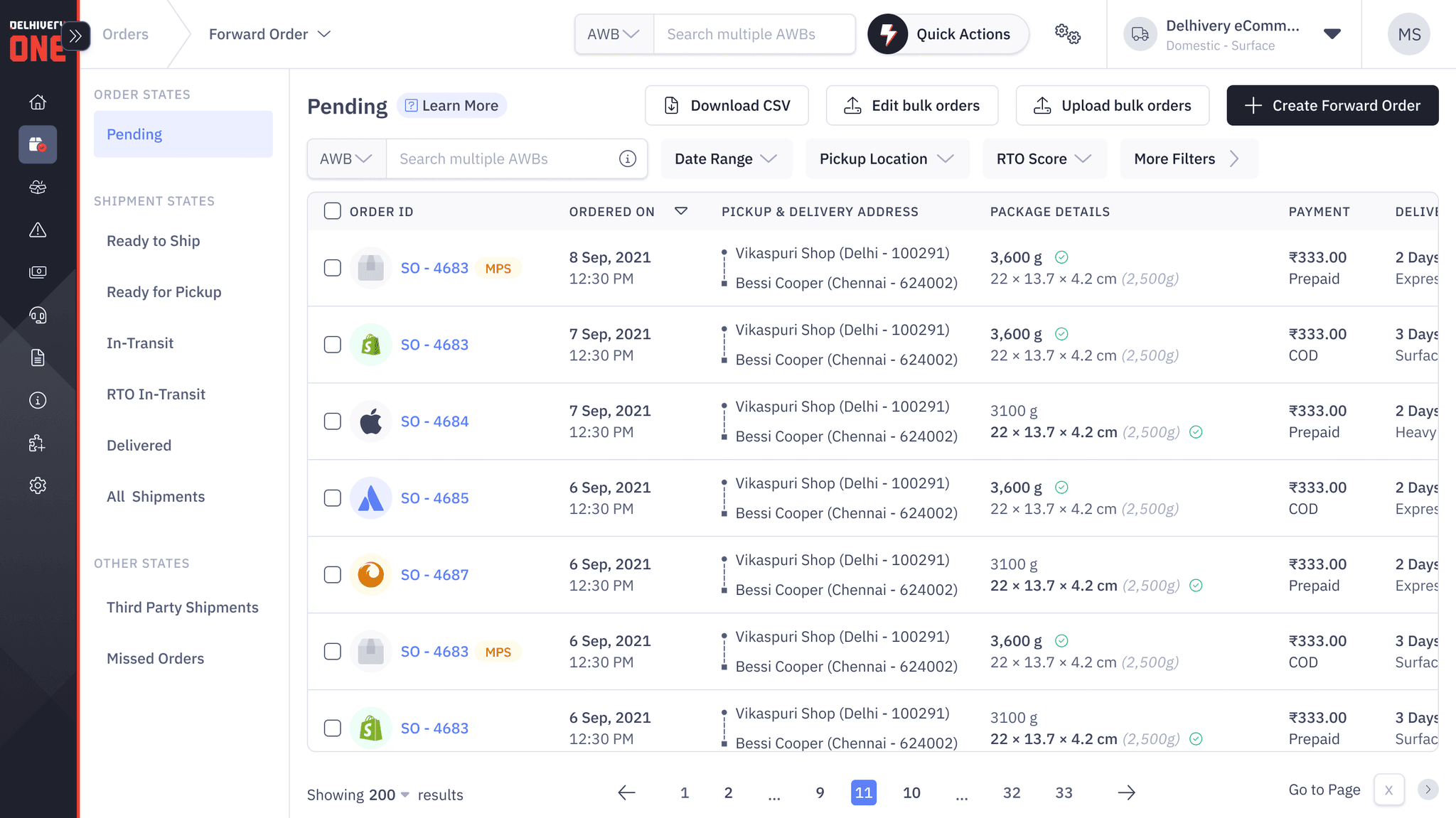
Before image of the table view
About Delhivery & Delhivery One
Delhivery stands as a leading logistics company, offering an array of digital services and products aimed at revolutionizing the logistics landscape. Delhivery One, specifically, serves as a cornerstone in this endeavor, providing businesses with a holistic platform to manage their logistics operations efficiently. Targeting medium and small businesses, Delhivery One caters to both B2B and D2C clientele, offering comprehensive solutions spanning from shipping to order management and tracking.
Problems In the conventional Tabular Format
Inefficient Data Processing
The tabular view hindered quick assimilation of critical shipment data due to the overwhelming number of columns.
Increased Number of Clicks
Users had to navigate through multiple pages to access detailed information or perform actions, resulting in a cumbersome user experience.
Scalability Limitations
The rigid structure of the table views hindered the accommodation of new data points, impeding future growth and adaptability.
Hidden CTAs
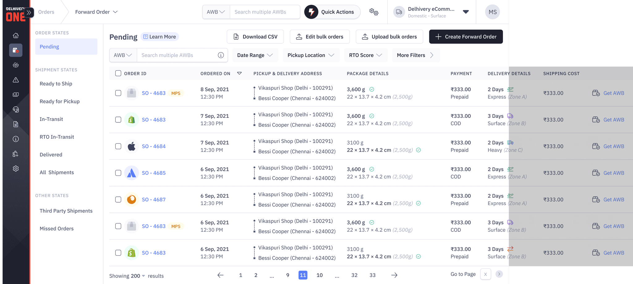
Crucial Call-to-Action buttons were hidden in the previous layout, resulting in an inferior user path, necessitating horizontal scrolling and ensuing in a fragmented user interaction.
Too much data leading
to increased cognitive load

Hidden CTAs
Not Scalable: Adding more columns will increase horizontal scrolling
Limitations of the conventional tabular format
Key Objectives of Redesign
Enhance Visibility and Accessibility of CTAs
Ensure critical call-to-action buttons are prominently displayed and easily accessible to streamline user actions.
Reduce Clicks for Common Actions
Minimize the number of clicks required for common user tasks such as viewing order details or initiating shipments.
Ensure Scalability
Design a flexible interface that can accommodate future growth and evolving business requirements seamlessly.
Uniform User Experience
Ensure a uniform and streamlined experience across mobile and desktop interfaces.
Design Process
The decision to transition to card views was informed by several key considerations:
Visual Engagement
Card views offer a visually appealing and intuitive presentation of information, capturing users' attention and facilitating information consumption.
Organized Presentation
By representing each order as an individual card, the redesign promotes a more organized and digestible display of data, enhancing user comprehension and navigation.
Scalability and Flexibility
Card views provide inherent flexibility, allowing for seamless integration of new data points and changes, ensuring long-term scalability and adaptability.
Responsive Design
Card views are inherently adaptable, making them easy to optimize for responsiveness across both desktop and mobile screens. This ensures a consistent and seamless user experience across various devices, enhancing accessibility and usability.


Different design iterations of the card views for Pending Orders Listing
Key Features of the Redesign
Card-Based Interface
Each shipment is now represented by an individual card, allowing for a more intuitive and visually appealing presentation.
Adaptive Design
The new layout supports the inclusion of new data points, ensuring scalability for future updates.
Front-and-Center CTAs
Call-to-Action buttons are now prominently displayed on each card, offering a consistent and accessible user journey.

Data Point Components

Default State

Hover State

Selected State

Error State
Different Card States
Results & Impact
Enhanced Visibility and Accessibility
By prominently featuring CTAs on each card, the redesign reduced user effort and improved task completion rates, driving overall user satisfaction.
Streamlined Navigation
The reduction in the number of clicks required for common actions resulted in improved user efficiency and navigation, enhancing the overall usability of the platform.
Scalability and Adaptability
The modular design approach enabled the seamless integration of new data points and changes, ensuring the longevity and adaptability of the interface to evolving business requirements.
Development Efficiency Gains
The establishment of a comprehensive component library and adherence to a robust style guide facilitated efficient implementation and maintenance of the redesigned interface, driving development efficiency gains and reducing time-to-market.


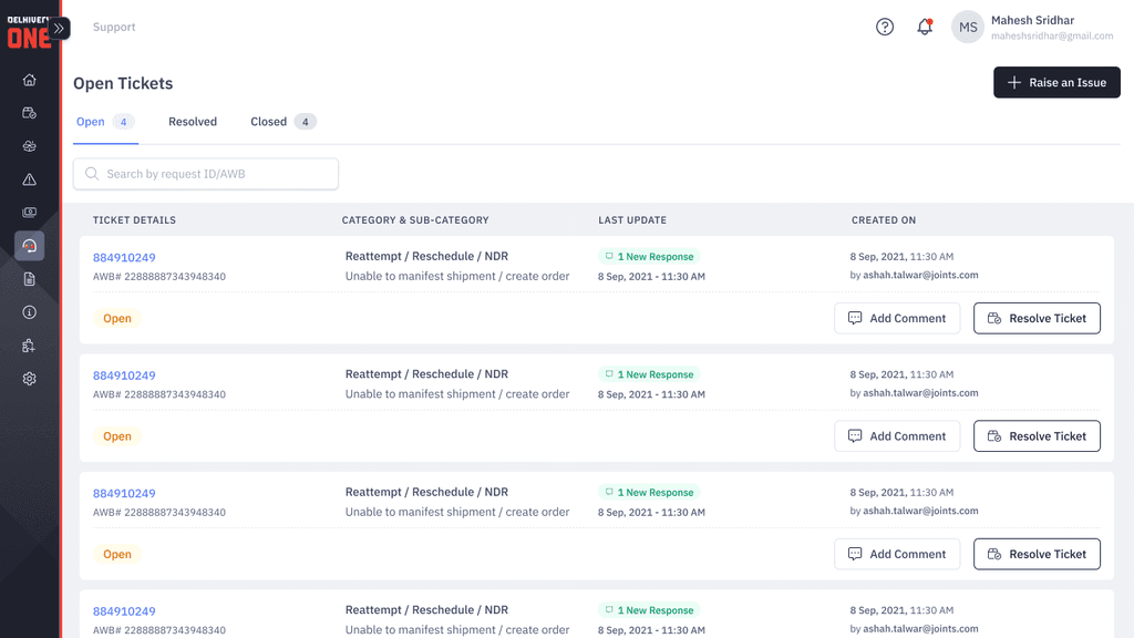
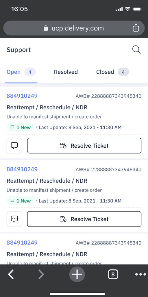
Card Layouts for Desktop & Mobile UI
Conclusion & Learning
The successful transition from table views to card views marked a significant milestone in enhancing the user experience of Delhivery One.
This project underscored the importance of prioritizing user-centric design principles and adopting scalable solutions to meet the evolving needs of users and the business alike, reinforcing the value of a meticulous and holistic approach to product design and development.

